
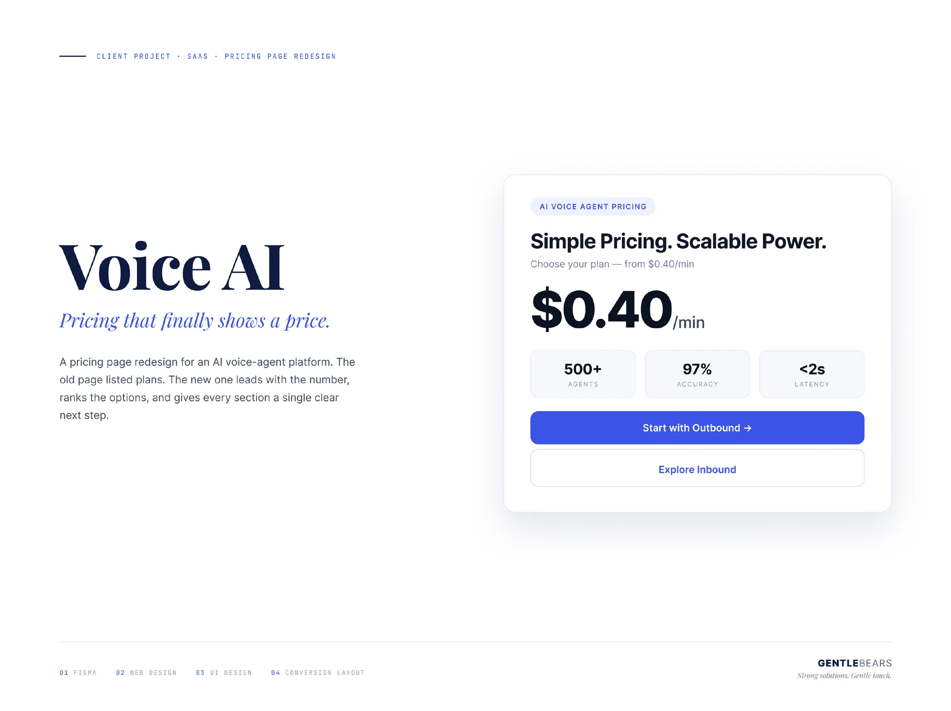
Voice AI
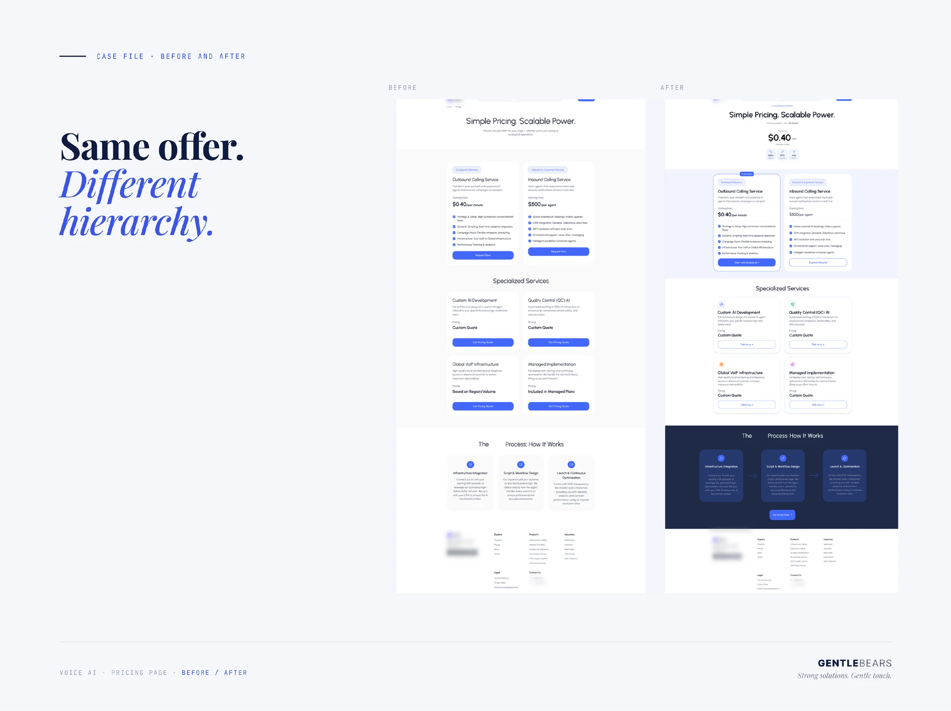
A pricing page that finally shows a price — same offer, different hierarchy.
Services
Product design, web design
Timeline
Focused design engagement
Stack
Figma, Web design, UI design, Conversion layout
What we set out to solve
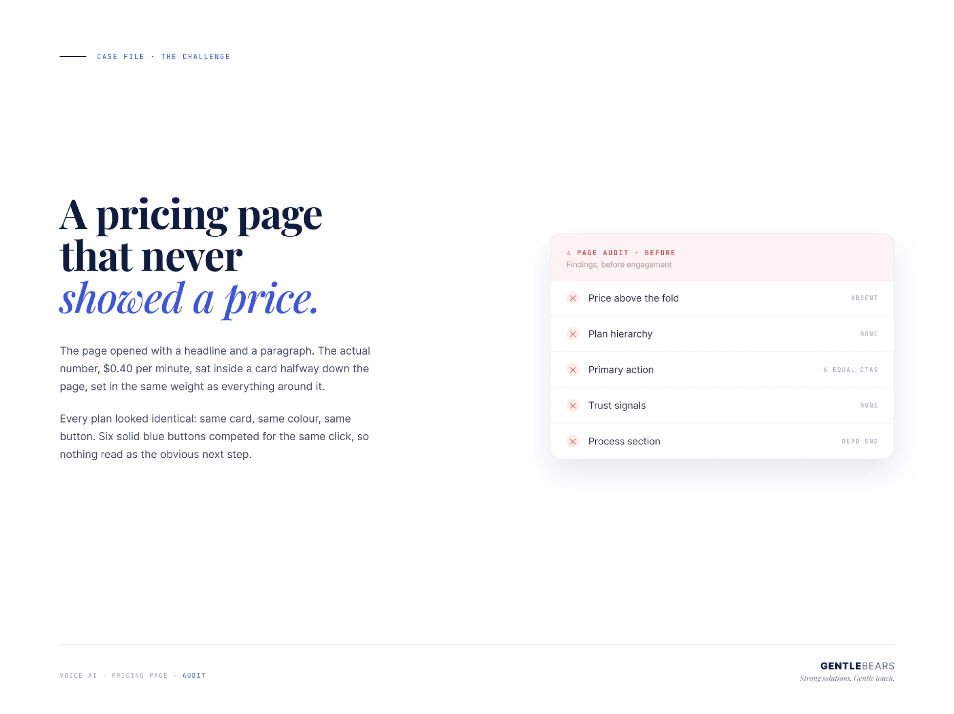
The page opened with a headline and a paragraph. The actual number sat inside a card halfway down the page, set in the same weight as everything around it.
Every plan looked identical: same card, same colour, same button. Six solid buttons competed for the same click, so nothing read as the obvious next step.
How we got there
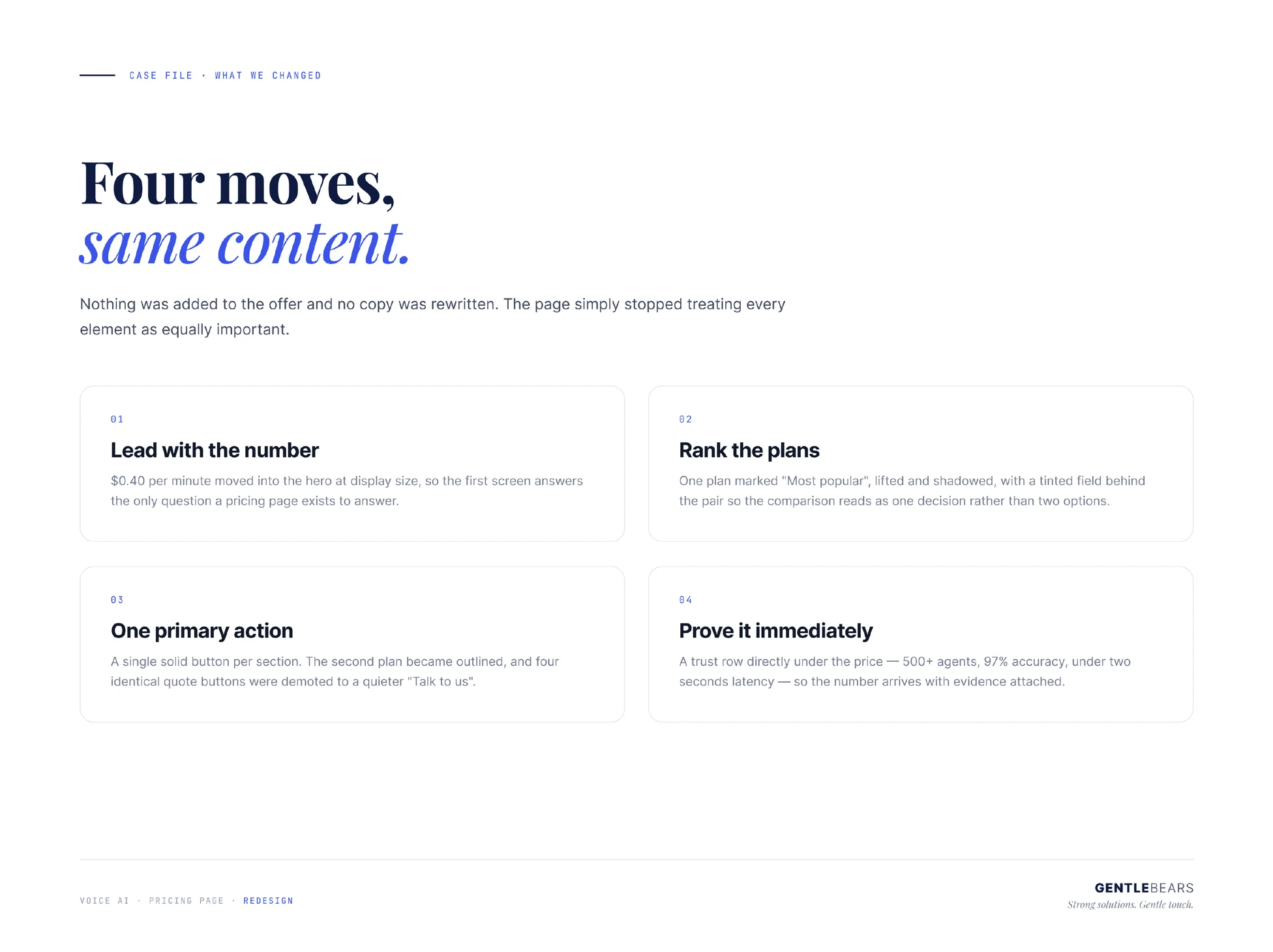
Four moves, same content — nothing was added to the offer and no copy was rewritten. The per-minute price moved into the hero at display size, so the first screen answers the only question a pricing page exists to answer. One plan was marked as most popular, lifted and shadowed, with a tinted field behind the pair so the comparison reads as one decision rather than two options. A single solid button per section: the second plan became outlined and four identical quote buttons were demoted to a quieter invitation to talk. And a trust row went directly under the price, so the number arrives with evidence attached.
What we shipped
What it delivered
Outcomes as delivered; product figures are the client’s own.
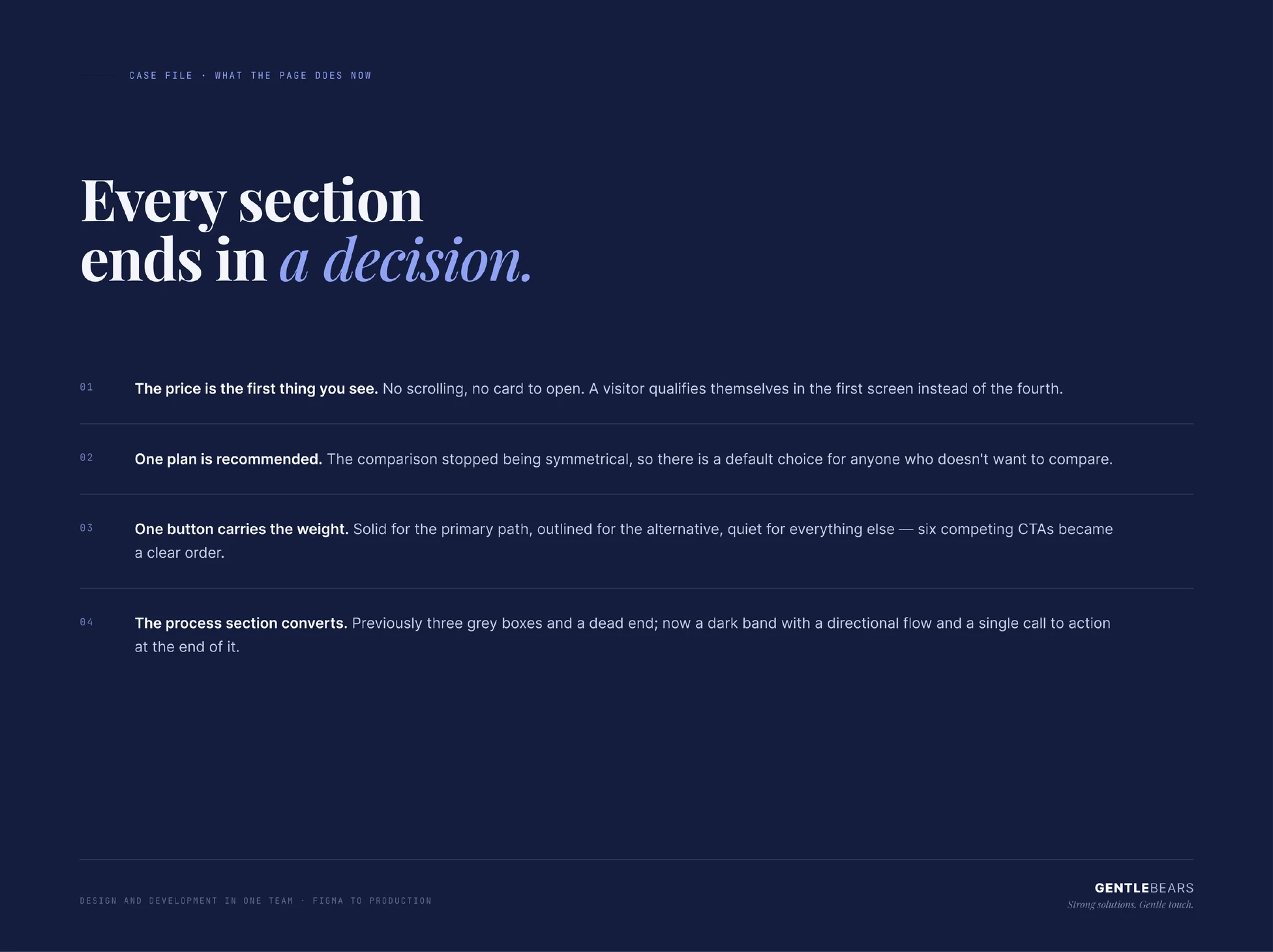
Price first
a visitor qualifies themselves on the first screen instead of the fourth
One recommended plan
the comparison stopped being symmetrical, so there is a default choice
Six CTAs → one order
solid for the primary path, outlined for the alternative, quiet for the rest
Want results like this?
Tell us about your project — we reply within two business days.